

Dark Graphic Hoodie: Choose a Statement That Lasts
What makes a dark graphic hoodie feel like your signature rather than someone else’s trend? The dark base is only the beginning. A striking print can command the whole look, while a quieter design lets the garment’s overall mood come through. Either way, the right choice should feel deliberate, not borrowed.
It’s easy to scan a grid of bold options and still be unsure what separates a lasting statement from a passing impulse. You want a graphic that reflects your identity, and a practical way to judge its impact before you choose. The goal isn’t to wear the loudest piece. It’s to find one that carries your point of view.
Use a simple framework: assess contrast, placement, and scale, then consider how the design fits your personal style. This will help you compare dark graphic hoodie designs and choose one with confidence. Cashvibez Eternity’s graphic hoodie collection, including the DOA Eternal Remains Hoodie, gives you designs to consider as you define what you’re looking for. Distinctive by intent, chosen to last.
Key Takeaways
- See how a dark graphic hoodie balances a familiar layer with a distinctive visual statement.
- Use contrast, graphic placement, and scale to judge how much attention a design commands.
- Compare bold, vintage-inspired, and minimal directions to find the character that suits your aesthetic.
- Follow a five-step checklist to narrow your options and make an intentional choice.
- Explore Cashvibez Eternity’s graphic hoodies and compare their design identities with your preferences.
Why Choose a Dark Graphic Hoodie Instead of Another Plain Layer?
A dark graphic hoodie is a hooded sweatshirt in a dark shade with a visible graphic. The distinction is simple: a plain dark hoodie keeps the surface quiet, while a graphic creates a focal point. The base remains familiar, and the design makes the choice feel intentional.
Dark doesn’t mean black alone. The term can describe shades such as charcoal, deep brown, or dark navy, though the shade of any specific hoodie depends on the product. The hoodie has evolved from a practical garment into an everyday streetwear staple. For background on its history and common design elements, explore the history of the hoodie. A graphic adds another layer of character to that familiar foundation.
What makes a dark graphic hoodie a statement piece?
Three visual choices shape a first impression: contrast, scale, and placement. A bright graphic against a dark base tends to stand out quickly. A smaller design can feel more restrained, while a larger one gives the eye more to take in. Placement matters too: a central graphic reads differently from one positioned elsewhere on the garment.
There’s no fixed formula for what counts as a statement. The right level of impact depends on your taste and how much attention you want the piece to draw. Choose what feels aligned with your identity, not what a trend says you should wear. A graphic doesn’t need to be loud to feel deliberate.
Who is drawn to dark graphic hoodie designs?
These designs appeal to shoppers who want more visual identity than a plain hoodie provides. You might be drawn to a prominent graphic, or prefer an understated design that still gives the garment a distinct point of view. The decision is about the kind of presence you want, not a prescribed outfit.
A graphic hoodie can also suit anyone looking for a familiar garment with a clear focal point, rather than one that relies on color alone to stand out. Before choosing, consider what catches your attention and whether you’d still value that design beyond the current trend. A strong personal fit outlasts a borrowed look.
Cashvibez Eternity’s DOA Eternal Remains Hoodie is one graphic hoodie to consider as you define your preferences. Look at the design and decide whether its visual identity feels right to you. Start with the kind of presence you want: confident, measured, or somewhere between the two. That’s the difference between adding another layer and choosing one with intent.
How to Read the Design: Contrast, Placement, and Visual Weight
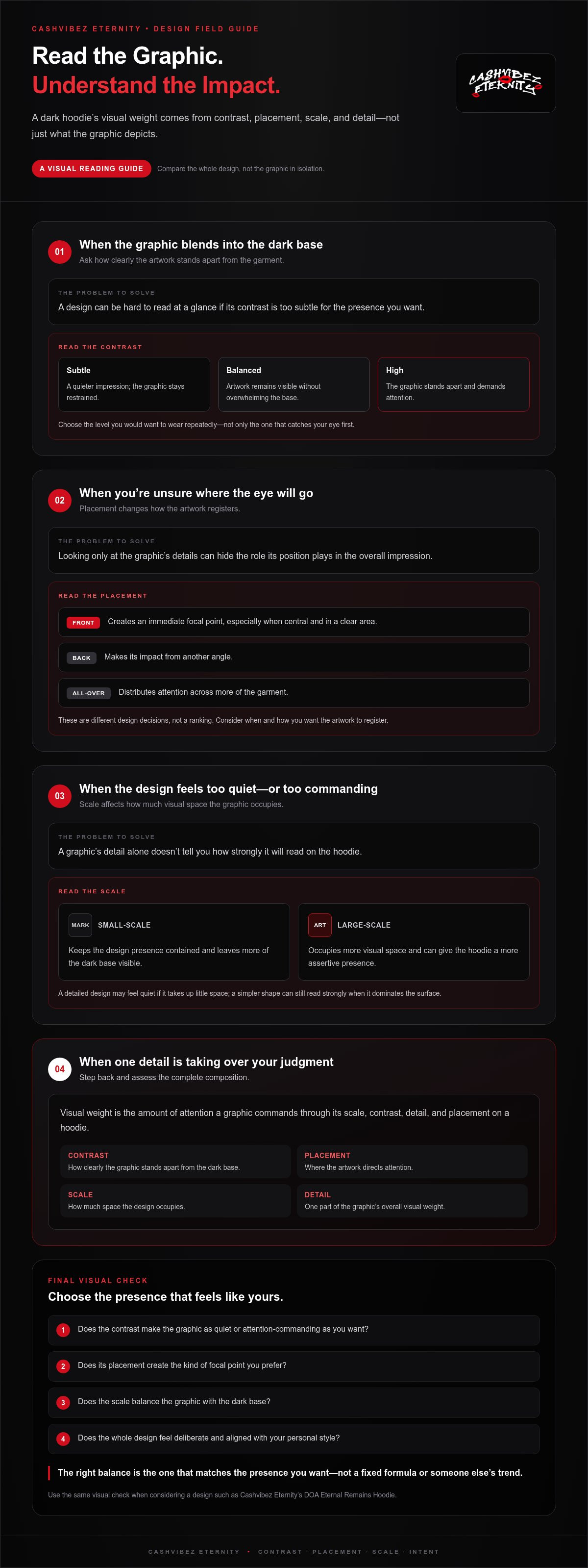
A graphic’s impact isn’t just about what it depicts. Notice how it sits against the dark base, how much space it occupies, and where it appears. These details shape whether a hoodie feels understated, balanced, or commanding. Compare the design as a whole, not just the graphic in isolation.
Visual weight is the amount of attention a graphic commands through its scale, contrast, detail, and placement on a hoodie. A compact mark with muted contrast may feel restrained; a larger, brighter graphic can draw the eye immediately. Neither is automatically better. The right balance is the one that matches the presence you want.
The relationship between garment and graphic is part of the hoodie’s expressive potential. The Guardian’s discussion of the hoodie as a streetwear trailblazer and personal statement offers context for seeing it as more than a basic layer. Let the design speak in its own register.
How does graphic placement change the look?
Placement directs the eye. A front graphic creates an immediate focal point, especially when it sits centrally and occupies a clear area. A back graphic makes its impact from another angle, while all-over placement distributes attention across more of the garment. These are different design decisions, not a ranking. Consider when and how you want the artwork to register.
Use a quick visual check when comparing options. Look at the overall impression first, then examine the details:
- Small-scale graphics tend to keep the design presence contained, leaving more of the dark base visible.
- Central graphics establish a clear focal point and make the composition easy to read at a glance.
- Large-scale graphics occupy more visual space and can give the hoodie a more assertive presence.
On a product page, compare the graphic’s proportions with the garment rather than judging it by detail alone. A detailed design may feel quiet if it takes up little space; a simpler shape can still read strongly when it dominates the surface.
How much contrast feels right for your aesthetic?
Contrast describes how clearly graphic elements stand apart from the dark garment base. Subtle contrast creates a quieter impression, balanced contrast keeps the artwork visible without overwhelming the base, and high contrast makes the graphic demand attention. Look for the level you’d choose repeatedly, not just the one that catches your eye first.
There’s no universal threshold for “too bold.” Ask yourself whether you want the graphic to lead the look or add a controlled detail. When considering a Cashvibez Eternity design, use the product images to assess its contrast, placement, and visual weight. Explore Cashvibez Eternity hoodies and compare the designs against those criteria.
Dark Graphic Hoodie Options Compared: Bold, Vintage, or Minimal
Three broad aesthetic directions can help you compare a dark graphic hoodie without getting lost in a grid of designs. Use them to identify what you’re drawn to, then judge each graphic on its own visual character.
Direction
Visual intensity
Design character
May suit shoppers who
Bold
High, especially when the artwork is large or strongly contrasted
Direct, expressive, and designed to draw attention
Want the graphic to lead the impression
Vintage-inspired
Variable, depending on scale and contrast
Suggests a nostalgic or heritage-influenced visual mood
Prefer character that feels evocative rather than strictly sleek
Minimal
Low to moderate, often with less visual information
Restrained, clean, and focused
Want graphic detail without making it the whole story
When does a bold graphic feel like the right choice?
A bold direction makes sense when you want the design to lead the look. Its impact depends on more than complexity: a large-scale graphic can feel prominent even with limited detail, while strong contrast can make a smaller design catch the eye. Consider both together. If you’re drawn to immediate presence and expressive visuals, bold may feel natural. It won’t suit every wearer or setting, and it doesn’t need to.
What makes a vintage-inspired or minimal graphic different?
Vintage-inspired describes an aesthetic, not the garment’s age. It may evoke a nostalgic visual language through the graphic’s composition or character, but the label alone doesn’t tell you about the garment’s wash, material, or finish. Minimal designs take the opposite route in visual intensity: fewer or quieter elements keep the overall impression controlled. Choose based on the character you want, not assumptions about construction.
Make the comparison useful by deciding what you want the design to do before choosing a category. Should it command attention, suggest a particular mood, or provide a quieter point of distinction? Then look at the image and assess its scale, contrast, and detail. A category is only a starting point. Two bold graphics can create very different impressions, just as two minimal designs can feel worlds apart.
Cashvibez Eternity sells graphic hoodies, including the DOA Eternal Remains Hoodie. Compare its design with your preferences rather than assigning it a style label without looking at the graphic. The strongest choice isn’t the one that fits a trend category most neatly. It’s the one that feels considered, distinctive, and true to your eye.
How to Choose a Dark Graphic Hoodie: A Five-Step Checklist
A clear process turns a crowded product grid into a considered decision. Move through these five steps in order. You’ll narrow your options by personal intent first, then check the practical details that matter before choosing.
- Define the statement you want. Name the impression you’re after before browsing: expressive, composed, enigmatic, or something else. This gives you a personal filter. You’re not searching for a design that everyone will understand; you’re looking for one that feels right to you.
- Assess the graphic’s intensity. Decide how much attention you want the design to claim. Think about whether you’d reach for it often or only when you want a more noticeable piece. This is about your comfort with its presence, not whether a graphic is objectively too bold.
- Compare design directions. Consider whether bold, vintage-inspired, or minimal graphics best reflect your taste. These are broad aesthetic labels, not guarantees about a garment’s age, construction, or finish. Focus on the design in front of you and how its character aligns with the impression you named.
- Review the garment details. Read the specific product page for its sizing information and other listed details. Don’t assume two hoodies share the same measurements or construction. If you’re comparing options, assess each one on its own terms.
- Choose with your own criteria. Revisit your first impression and make sure the design still feels personal after you’ve checked the details. If you’re torn, consider which option you’d be glad to wear beyond the moment you first saw it. Then make the call with intention.
Which details should you check before choosing a size?
Use the sizing information on the specific product page rather than relying on a general assumption about how hoodies fit. Compare any listed measurements with a garment you already find comfortable, using the same points of measurement where possible. This gives you a practical reference without guessing at a size range or fit description.
How can you tell whether the design will stay true to you?
Ask what feeling or visual impression you want the graphic to convey, then consider whether that preference has stayed consistent over time. A lasting personal choice comes from your own taste, not a trend’s current momentum. Keep that question separate from durability: an aesthetic preference alone can’t establish how a garment or graphic will wear.
The strongest comparison weighs personal meaning first, product details second, and trend pressure last. Use that principle as you explore the Cashvibez Eternity hoodie selection and consider whether the DOA Eternal Remains Hoodie fits the statement you want to make.
Explore Cashvibez Eternity’s Dark Graphic Hoodie
Good selection comes down to more than spotting a graphic you like. Look for a design whose identity feels aligned with your own, then use the item-specific information to make a considered choice. The DOA Eternal Remains Hoodie is one place to start: assess its graphic design using the criteria you’ve established.
How does the DOA Eternal Remains Hoodie fit this search?
The name gives you a design identity to consider, and the hoodie is part of Cashvibez Eternity’s graphic hoodie collection. Let your own response lead. Ask whether the design feels distinctive to you and reflects the kind of statement you want to make. Judge the item by its product images and listed details.
A product name can suggest a mood, but your choice should rest on the design itself and the information shown for that item. Consider how the graphic aligns with your preferences for visual intensity and overall character. Then review the product page for the garment information you need before deciding. This keeps the choice grounded in what you can assess.
Cashvibez Eternity’s other graphic hoodie designs have their own identities: the Fortune in Flames Graphic Hoodie, the Wild Money Leopard Print Zip-Up Hoodie, and the Vintage Washed Eternal Dynasty Hoodie. Compare each design’s presentation with your taste. The aim isn’t to choose by label alone; it’s to find a piece you can stand behind.
Where can you continue your Cashvibez Eternity search?
Take your criteria into the store. Compare the graphic hoodies by their presented design identities, and use each product page for item-specific information. If the DOA Eternal Remains Hoodie catches your eye, assess it by the qualities that matter to you, not by a passing trend.
Make the choice your own. Explore Cashvibez Eternity and find the statement that speaks to your aesthetic.
Make Your Next Choice With Intent
The strongest style choices don’t need to announce themselves as trends. They become part of your visual language because you chose them with purpose. Imagine wearing the design beyond the first impression. Does it still feel like you? That answer matters more than whether it’s the loudest option in the room.
Let your next dark graphic hoodie reflect your own direction. Cashvibez Eternity offers graphic pullovers and printed zip-up hoodies to explore as you decide which design feels aligned with your style. Choose with confidence, not pressure. A personal signature starts with one considered decision.
Explore Cashvibez Eternity and choose the piece that speaks to your aesthetic.
Frequently Asked Questions
Is a dark graphic hoodie always black?
No. “Dark” describes a general shade category, not one exact color. The shade varies by product, so use that item’s product details and images rather than assuming it’s black. If color matters to your decision, compare the product’s visual information carefully and remember that a screen image may look different in other settings.
Can a dark graphic hoodie work for someone who usually wears minimal designs?
Yes. Choose a graphic that feels like a natural extension of your taste, rather than a sudden change made to follow a trend. Compare the design’s overall impression with the level of detail you typically prefer. If the graphic feels too prominent, keep looking; if it adds character without clashing with your preferences, it may be a considered step beyond plain basics.
How do I judge a hoodie graphic from product photos?
Review every available view, not only the first thumbnail. Check where the graphic sits and how it appears across the garment in different images. Then read the product description for item-specific information, including sizing details. Photos can help you judge visual character, while the written description provides listed product information. Use both when comparing options.
Can a dark graphic hoodie fit a more polished casual dress code?
It depends on the setting’s expectations and the design’s overall presence. A relaxed creative gathering may leave room for a more expressive graphic, while a workplace with a conservative dress code may call for a quieter choice or a different layer. Consider the context before deciding. A hoodie can be a personal-style choice, but it isn’t a universal replacement for formalwear.
What should I do if the hoodie’s size information is unclear to me?
Start with the specific product page and note the measurements it provides. For a practical reference, lay a hoodie you already like flat and measure the same points, such as chest width or body length, if those are listed. Consider how you prefer your clothes to fit. Don’t rely on a familiar size label alone, since sizing can differ across brands and product styles.
Are product names the same as hoodie style categories?
No. A product name identifies an individual item; a phrase such as “dark graphic” or “minimal” describes a broader aesthetic. For example, DOA Eternal Remains Hoodie is a specific Cashvibez Eternity product name, while “dark graphic hoodie” is a category phrase. Use names to identify particular offerings and style terms to describe the visual direction you’re looking for.
Explore Cashvibez Eternity’s graphic hoodies and choose a design that fits your style.